Android Auto continues to work toward adding features people really need in the car. The latest update brings a few minor surface-level changes, and under the hood there are some new features that may be pretty useful, including an auto-resume feature for music (or podcasts and audiobooks), a filter to prevent group messages from becoming too distracting, and more.
What’s New
Widescreen support
If you have one of the recently released vehicles with a widescreen head unit, you can now get Android Auto to fill the display. I don’t have one of these handy to test, but a post to reddit by Life_overdose includes a photo of widescreen view in operation.
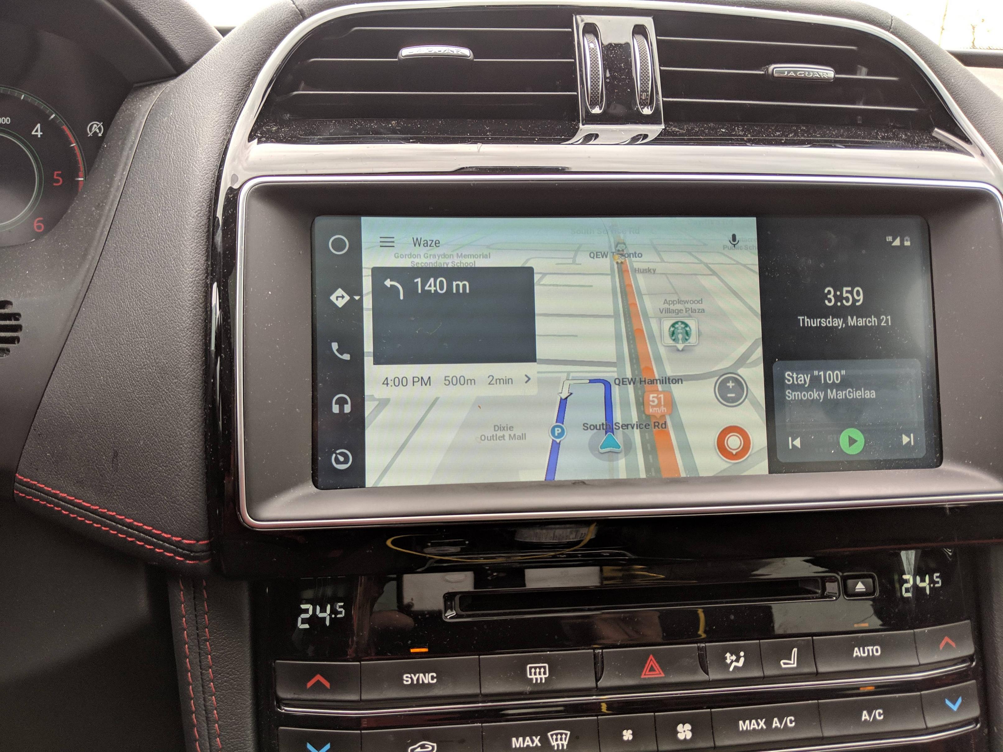
Image credit: Life_overdose.
As the photo demonstrates, the virtue of widescreen support is that UI elements can be spread out to the side where they won’t obstruct the screen. In this instance, a clock and audio controls are allowed to display on the extra space while Maps is in control of the primary view.
As noted in the reddit post, getting Android Auto to display in this view required opening developer settings and enabling the switch to allow 1080p resolution.
To open developer settings: Open Android Auto, switch to the About screen, and tap the title bar a few times until you are asked if developer mode should be enabled. Now you’ll find a link to developer settings in the overflow menu.
Keyboard improvements
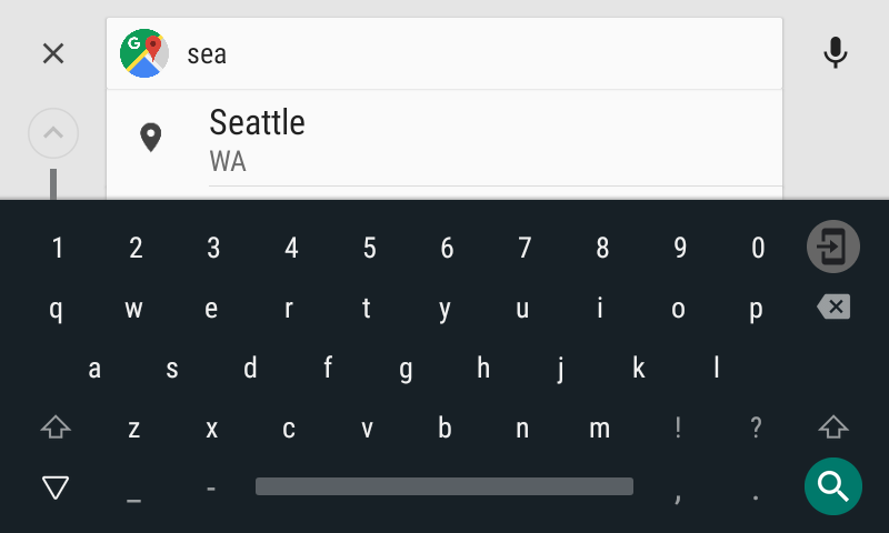
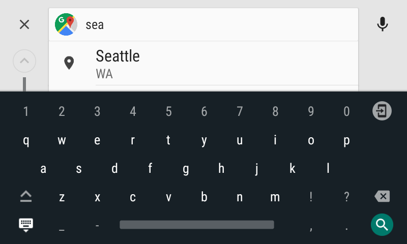
Left: v3.9. Right: v4.1.
If you look close, there are a couple layout changes and some revised icons. The older layout included a shift key on both sides of the keyboard, which probably wasn’t very useful in a car, and placed the backspace button at the top right, just below the button that opens a keyboard on the phone. The latest version removes the shift key from the right side and the backspace button has been moved down to take its place.
As for icon changes, it’s basically just the two buttons on the bottom left for caps lock and hiding the keyboard. There is also a size adjustment to the button at the top right for opening a keyboard on the phone.
I tried pretty hard to find any functional improvements, but I can’t say that that anything else jumped out at me. The changes appear to be pretty minimal, and entirely cosmetic, so they’ll probably go unnoticed by most people.
New Call UI


Left: v3.9. Right: v4.1.
The new call UI seems to be much the same story as the keyboard improvements. There’s no sign of functional changes, but as you can see, the content screen has been tweaked to have a moderately different look.
Call data is now aligned to the left side of the screen with a round profile image floating to the right. This differs from the old version where the call data was centered and the profile image was used as a background, but was heavily tinted and obstructed by interface elements, almost to the point that it wasn’t very recognizable.
Teardown
<![CDATA[.teardown{color:black;font-family:Consolas,Monaco,'Andale Mono',monospace;white-space:pre;word-spacing:normal;-moz-tab-size:4;-o-tab-size:4;tab-size:4;-webkit-hyphens:none;-moz-hyphens:none;-ms-hyphens:none;hyphens:none;display:block;overflow:scroll;}.token.comment,.token.block-comment,.token.prolog,.token.doctype,.token.cdata{color:}.token.punctuation{color:}.token.property,.token.tag,.token.boolean,.token.number,.token.function-name{color:}.token.selector,.token.attr-name,.token.string,.token.function{color:}.token.operator,.token.entity,.token.url{color:background:rgba(255,255,255,0.5);}.token.atrule,.token.attr-value,.token.keyword,.token.class-name{color:}.token.regex,.token.important{color:}.language-css .token.string,.style .token.string{color:background:rgba(255,255,255,0.5);}.token.important{font-weight:normal;}.namespace{opacity:.7;}.token.linebreak{opacity:0;display:block;}
The features discussed below are probably not live yet, or may only be live for a small percentage of users. Unless stated otherwise, don’t expect to see these features if you install the apk. All screenshots and images are real unless otherwise stated, and images are only altered to remove personal information.
Auto-resume
Some people want to start their car and hear music as soon as possible. While most cars support this with their built-in audio sources, there has never been a way to automatically resume playback from audio apps designed for Android Auto. It looks like that will be changing. An entry has been added to the settings screen (but not yet active) that will offer to automatically resume playback when Android Auto launches.
This isn’t too dissimilar from the Quick Start feature that has been under development in YouTube Music.
As you might expect, the setting is currently disabled by default, and it will probably remain that way because nobody wants to update the app and suddenly find music blasting the next time they start up their car. There’s no sign of text or other ways to inform users when this setting goes live, but we’ll keep watching for it and post when it happens.
Setting: Show group notifications
It wasn’t long ago that Android Auto added the option to see message previews while the car is stopped, and now it looks like more notification tweaks might be coming soon. The latest addition prepares a toggle that will “show group notifications.” A description goes on to say, “for all group messages.”
In short, with this setting enabled — which is how it will be set as a default — you will get basically all incoming messages. If you turn it off, notifications will only pop up if a message is directed to you specifically.
Show or hide the Android Auto icon
This one is technically straightforward, but with the catch that it could be one of two different things. The text implies one thing, but logic suggests another.
An entry for a new setting was added with the mostly useless title: “Use Android Auto on phone.” The summary displayed with it gives more meaning by explaining that the setting will “add app icon to Home screen.”
So far, this sounds like a feature that will forcibly add the app icon to your homescreen, which most of us probably think of as a pretty useless feature since it can be done just as easily by dragging the icon from the app drawer, but it might be useful for friends and family that are often unaware or confused about how things like that work.
However, the setting itself is coded as a SwitchPreference, or basically a toggle that can be flipped back and forth. These also come with a toast message that explains the icon will be added to the home screen (soon) or removed. To me, these details sound more like a setting to hide the app icon from the app drawer, a feature offered by some other apps like Gboard. At least this type of feature makes sense for users that insist on keeping their app drawer as clean as possible, especially if they never actually need to open Android Auto outside of connecting it to a car.
I feel silly for getting even a little analytical about this one, but it was worth mentioning that something of this type is coming, even if it’s not terribly exciting. And in the offhand chance an Android Auto team member sees this, maybe it will prompt a revision of the text to be a little more clear about its purpose.
Download
The APK is signed by Google and upgrades your existing app. The cryptographic signature guarantees that the file is safe to install and was not tampered with in any way. Rather than wait for Google to push this download to your devices, which can take days, download and install it just like any other APK.